
We recently had some healthy debate about a potential new view in Flipper Cloud. The debate's not fully settled, but thanks to feature flags, we were all able to agree it was worth some exploration. Where a lack of complete agreement might doom an idea on some teams, we knew there was little risk adding a new view behind a feature flag.
Instead, thanks to our confidence in test driving something behind a feature flag, we've each been running a leg of the idea relay race in our free time and passing the baton until it's evolved into something we're all excited about. It's been a circuitous route, and we're not done. The process, however, has felt fluid and productive. With less risk at each step of trying something new, we were each able to iteratively dabble with the idea until we all started to feel good about the end result.
This is the unfiltered view of how it went down while we were all busy focused on other things. Each of used a few spare moments here and there to float improvements to the idea and tinker to refine it. There were no planning meetings. We didn't do a high-fidelity mockup. We just built it behind a flag and kept going.
Half-heartedly Floating a Thought
As the newest team member with the fewest pre-conceived notions or Flipper experience, I try to share all of my fleeting thoughts in case any of them might be fresh perspectives that stem from my lack of exposure to Flipper's history.
Frequently, there are very clear cut reasons why they're bad ideas. Sometimes, it's something that the rest of the team has already thought about but simply hasn't gotten around to. And occasionally, the ideas are fresh and merit discussion. In each of the cases, the resulting conversation is always helpful and informative.
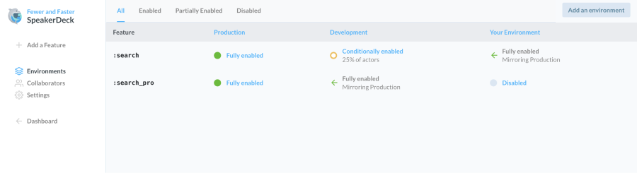
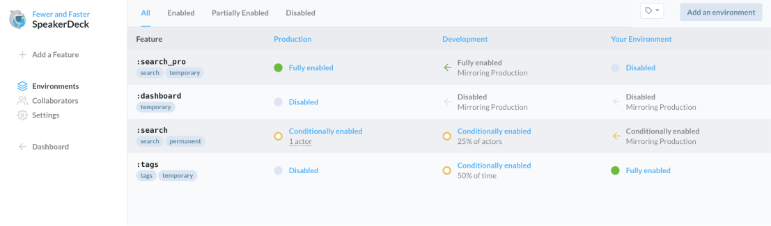
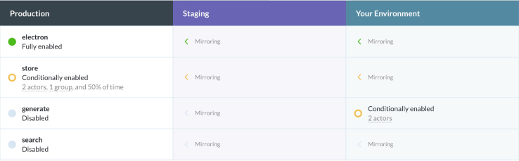
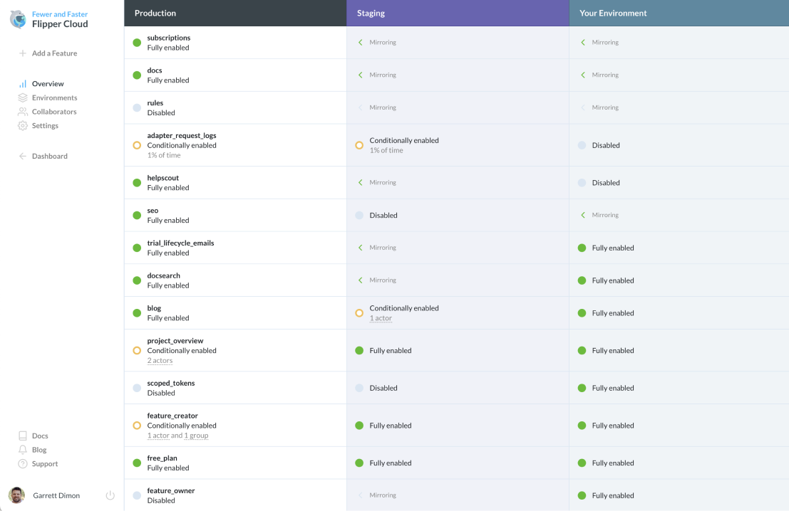
Since I started working on Flipper, I've wanted an overview of all environments for a project so that I could see at a glance what state all of our feature flags are in relative to production. Are they inheriting from production or overriding it? If they're overriding it, what are the current settings?
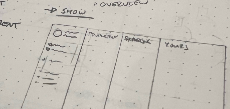
While I was still learning my way around the codebase, I wanted to visualize what I was thinking, so I started sketching as a way to think through things. It didn't take long to like what I was seeing and decide to create a really rough mockup to share with the team.
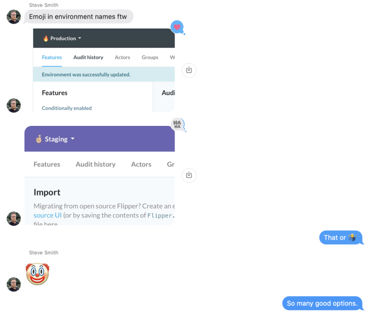
So on Tuesday, June 27th, I floated an idea in our group chat. It would end up being well over a month before we gave it another thought. I didn't worry about style, colors, or alignment. I didn't waste time thinking about typography or icons. I just made it a little more readable than it would have been from my sketches. It took maybe half an hour, and I tossed it to the team. At the time, the conversation was mostly about how it was loosely related to various ideas we've each had.
Nobody was enthusiastic enough to encourage dropping everything to try and build it, so it just kind of existed. We were wrapped up in work to offer free plans on Flipper Cloud, and we had several other features to work on. Nobody had shot it down, but nobody was in a spot to advocate for it.
I knew it would come back up if it had merit, but it was clear that it didn't need to be a priority. So the idea went on the back burner, and we moved on.
Tangential Re-invigoration
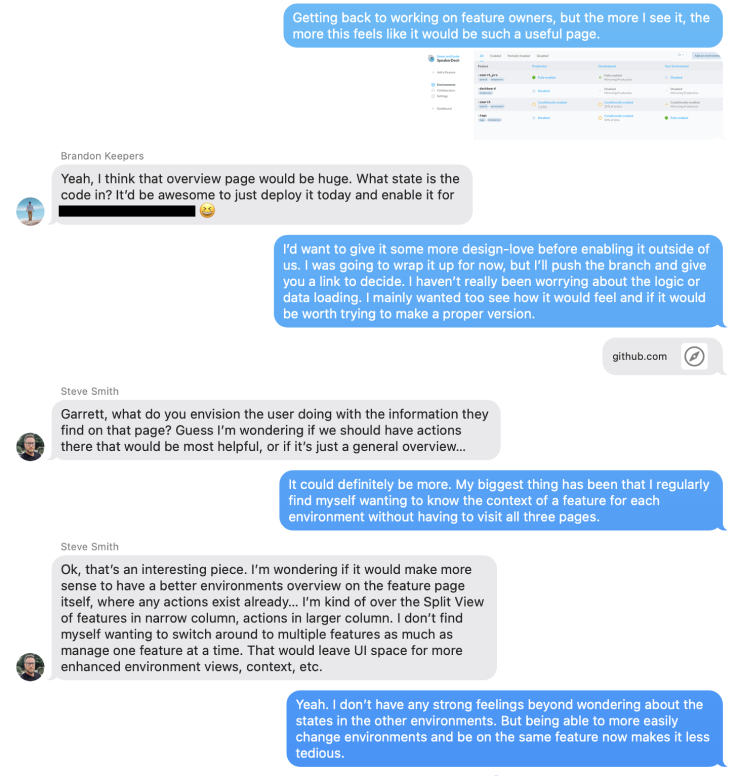
Almost a month later on August 21st, Steve started experimenting with some navigation changes related to how people switch between environments. His solution was trying to improve a lot of the same problems as my prototype, but his approach focused on simplifying existing elements rather than creating all new elements.
That discussion lead to more thoughts about how we handle environments within the application, and we wanted to think more about how we could visually differentiate them so nobody would accidentally turn a feature flag on in the wrong environment.
Eventually, all that exploration exposed some deeper thinking on environments and managing feature context across environments. It also established a color scheme we could use to ensure it was always clear what type of environment you're currently viewing.
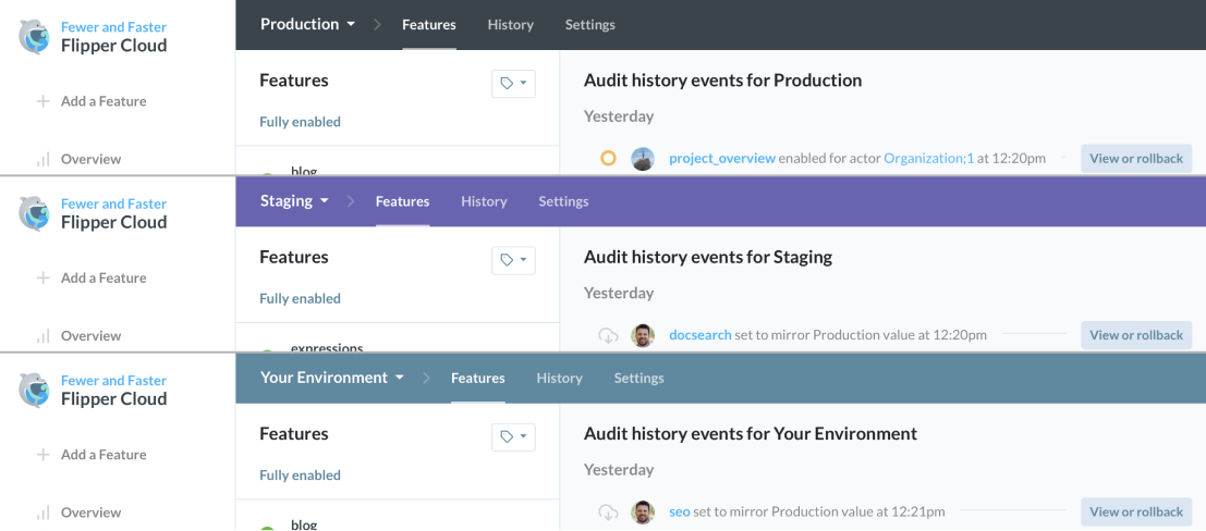
At the time, I didn't give it much thought, but as we iterated on the improved environment navigation, the original mockup popped back into my head. A few days later, we launched the new environment bar on August 24th. After using it a bit, and with more familiarity with codebase, I was able to cobble together a working prototype of a project overview page inspired by ideas from the new environment navigation.
1. The First Leg of the Relay Creates a Spark
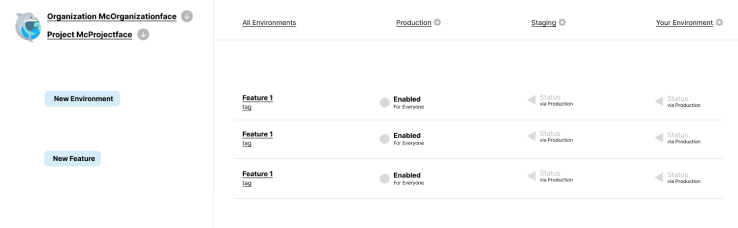
After we released the environment navigation and Flipper 1.0, we had some time to catch our breath and chip away at some other changes. The project overview was still on the back burner, but when I needed a break from my primary work, it was a perfect thing to tinker with. So on August 30th—more than two months after originally throwing out the idea—I hacked together a working prototype.
Once I had a working prototype locally, I could get a better feel for the challenges we would face in order for the page to justify itself. All of the issues felt like solvable problems, so I shared it with the team. But while we were slightly more open to it, it still wasn't a slam dunk idea.
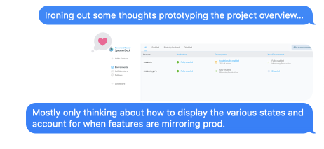
I wasn't really sold yet either, but it felt like there was something there. So I iterated a little more to get it to a point where it felt like we could have some interesting conversations around it.
Unfortunately, it wasn't something I was ready to pour a lot of attention into. Moreover, I knew I'd never be able to get it across the finish line alone. So I shared it with the team without planning on taking it any further any time soon. I figured it would get legs of its own if there really was something there.
We were all starting to see the potential, but still none of us were at a point to commit to the idea in general—let alone the specific execution to bring it to life.
2. The Second Leg Runs with the Spark
The next day on August 31st, Brandon responded to a support request from a customer looking for that exact feature. Since we had already been dabbling, he was excited to work on it and picked up where I left off. While I had never taken it to the point where it was worth putting into production, Brandon was ready.
With the extra motivation of a customer asking for exactly what we had already been working on, he wanted to move on it. He had some time and took my half-baked prototype from an exploratory idea to a usable tool.
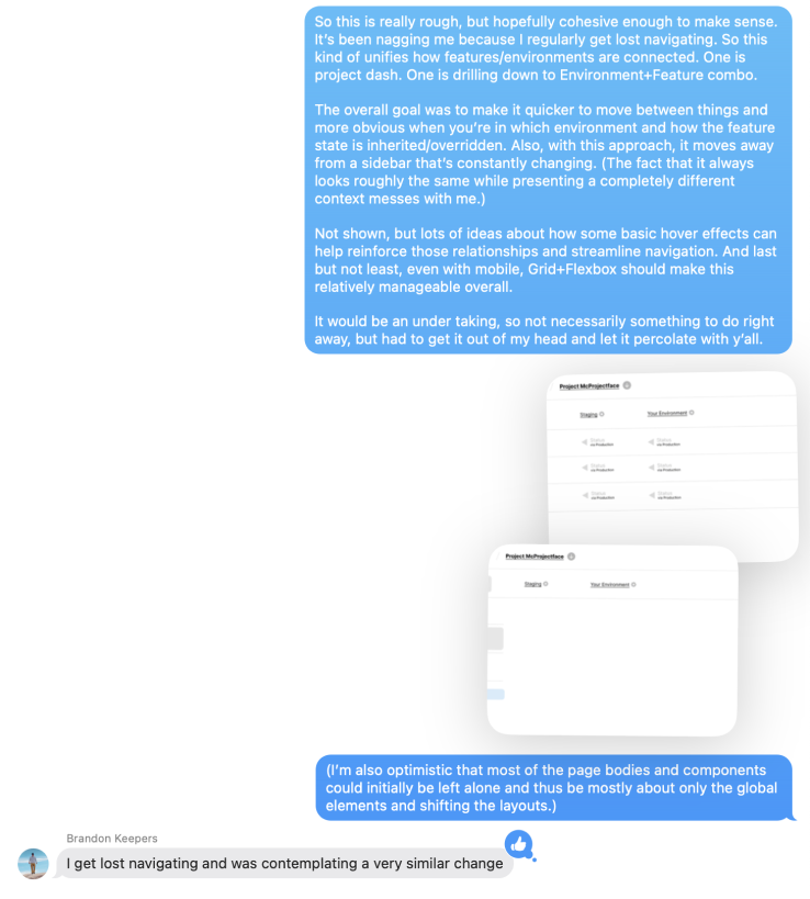
The moment he shared his improvements, it reignited my hope we could actually make it happen. We iterated some more and decided it was good enough to put in production behind a feature flag. We could enable it for just our team and call it a day.
We thought that would be it for a while. We could use it for a bit and see how we liked it. If everyone was on board, we could carve out some additional time for it, but it wasn't a significant priority. But instead, something else happened.
3. The Third Leg Presses the Accelerator
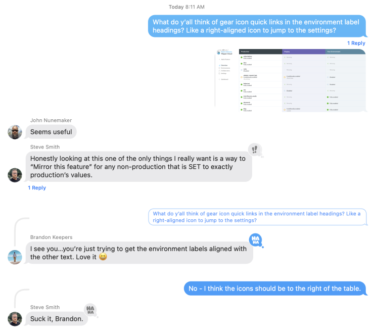
While Steve was the most hesitant originally, putting the less-than-polished version into production behind a flag mean that Steve could take it for a spin for the first time. Fortunately, Brandon and I had found the right balance of "good enough to not totally dismiss" and "ugly enough to want to do something about it" for Steve to take the next steps.
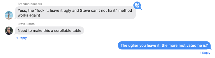
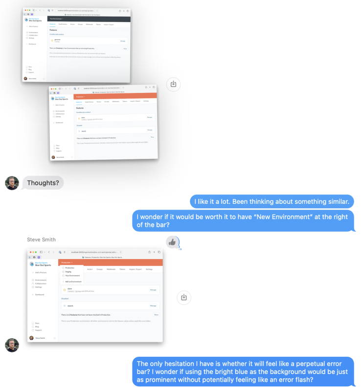
Steve liked where we were heading, but it wasn't up to his standards visually. So right when we figured we'd just pick it back up at some point down the road, Steve throws out some visual updates that start to make it feel like a real thing we could ship.
Once Steve's changes went live, we had a little more discussion, but nothing felt important enough to work on immediately. We had a little more casual conversation and discussion, but we all knew that the best next step is to simply use it in the context of real work.
4. The Anchor Closes it Out
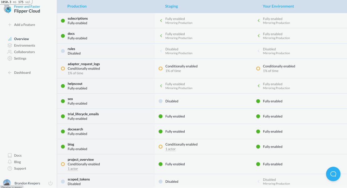
We're liking it enough to start investing in bring it to life, but there was one major element we had been ignoring thus far—performance. Flipper isn't a huge application, but pages like this are loading a lot of disconnected data. Fortunately, by the time we got here, everybody was on board.
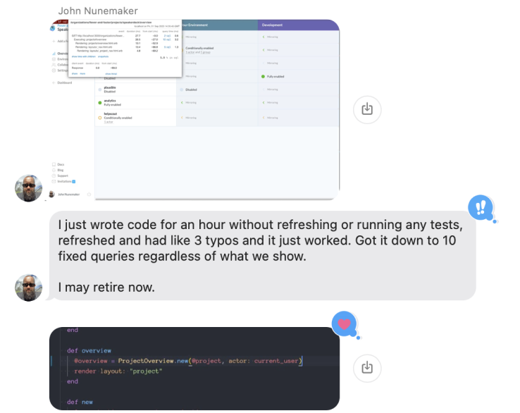
So with it settled into a good place, John spent some time on performance so we can be confident that it works well for large customers with multiple environments and lots of features. Ignoring performance while prototyping helped us make changes and iterate quickly so that we could get to the point where we felt it was worth paying attention to performance.
Letting it Simmer
With all of the major elements covered, our new project overview is ready to simmer for a little bit. We'll use it internally for a week or so and decide if it's good enough to release more widely or if we need to make some other changes before that.
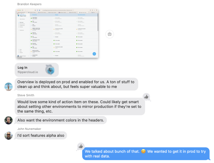
We'd still like to add sorting and filtering along with some convenience actions, but we feel pretty good that the page is helpful as is even if we wait a bit longer to add those. Either way, we're really close, and we can use the feature flag to gradually expand it to other teams until it's ready to go live for everyone.
By themselves, feature flags didn't magically make all of this work easier, but in this context, the effort would have likely stalled out before even the partially-finished version could be used in production.
Feature flags gave us the confidence to move forward without worrying about whether we had to see it through or how it would affect customers. It gave us a way to dip our toes in the water before decidign to jump all the way in, and that opens a lot of doors.
The Magic of Feature Flags
When exploring an idea or building something requires high levels of buy-in and commitment from everybody at the same moment, a spark for an idea can be extinguished before it even has a chance.
When an idea can make progress slowly and safely in everyone's free time over the course of months, there's less risk. The idea can simmer while everyone riffs on it. In our case, I lobbed out an idea that didn't get much immediate traction. Later I had more knowledge, and it felt worth prototyping.
Once we had a branch with a rough prototype, Brandon received a support reqeust for the idea and got fired up enough to make my prototype more usable. Once it was usable (even with bad performance), we felt good enough to release it to production behind a flag so only we could try it in our real daily work.
At that point, Steve was fired up enough to pick it up and improve the visual design of the page because he wouldn't be bogged down by any of the implementation. He tied it in with his recent environment navigation updates, and we were able to push it to production without a second thought.
Once it worked well enough and looked good enough that we saw it having a bright future, John was able to dive in and make sure it was fast. And since each of us had done a portion of the work, John could focuse purely on performance.
It was more like running a relay race where we were each able to contribute in our own way while setting up the next person. So now we have a working page that we could theoretically enable for other customers any time now.
We still want to add some additional functionality to the page so that it's less of a report and more of an interactive tool, but for now, we're able to use it ourselves on a daily basis and make sure it feels right to us.
Soon we'll roll it out to some of our larger customers to help gather feedback and fine tune it before turning it on for everyone. That's just one of the ways that feature flags change the equation and reduce the risk of exploring and testing ideas under real-world conditions.